EXAMPLES OF WORK
Throughout university and in my personal time, I have worked on developing
and honing my skills in a variety of design disciplines
as well as communication skills and processes.
Throughout university and in my personal time, I have worked on developing
and honing my skills in a variety of design disciplines
as well as communication skills and processes.


Habitat proposes a collection of resources designed to provide support to residential leaders in
facilitating and encouraging sustainable, ethical and environmentally friendly lifestyles to
students living in college communities.
Developed from first hand experiences and qualitative research with the intended end user, the product has been purposefully designed and to an extent co-created with those who it would provide a valuable resource. The design aims to avoid common stereotypes for sustainability products, and instead be associated to the cause purely by the content and typographic treatment.


Collaborative Project
@brontemckell
@hannahcurley
@nathantee
As the design team manager of the University of Newcastle’s 2018 Visual Communication Design Graduation Exhibition, I was responsible for managing the tasks and work of my peers to present
a cohesive, well established look and feel for the showcase of our final projects.
Additionally, I assisted with the development of the identity and branding of the show in addition to the design of the catalogue. As well as producing and managing the correct and cohesive application of the style guide. In this process I worked closely with the exhibition committee and university staff, all our contributions aligning to produce something we could all be proud of.
Up Next aims to showcase the up and coming design graduates of Newcastle as they begin to enter industry. They are forward thinkers, passionate and professional. This is what we aimed to capture across the collateral of exhibition.

The prototype tourism app, Welcome to Huskisson was made with the intent to provide value to small families on budget travel - informing them of low budget accommodation and activities suitable to the whole family. Design elements take inspiration form the natural environment of the location. Research was conducted into UX features and accessibility to understand how to best cater for the determined user group.


During my time working at The Australian Type Foundry (ATF) with Wayne Thompson I assisted in the creation of the album artwork for music group, Nerds & Music. The lettering was designed by Wayne, my role was to translate the sketch into an Adobe Illustrator file.
This process involved complicated typographic vectoring, which required precise use of the pen tool. Through the process of the project I learned valuable industry tips. The final artwork and design of the album cover were completed by Wayne - example visible above.


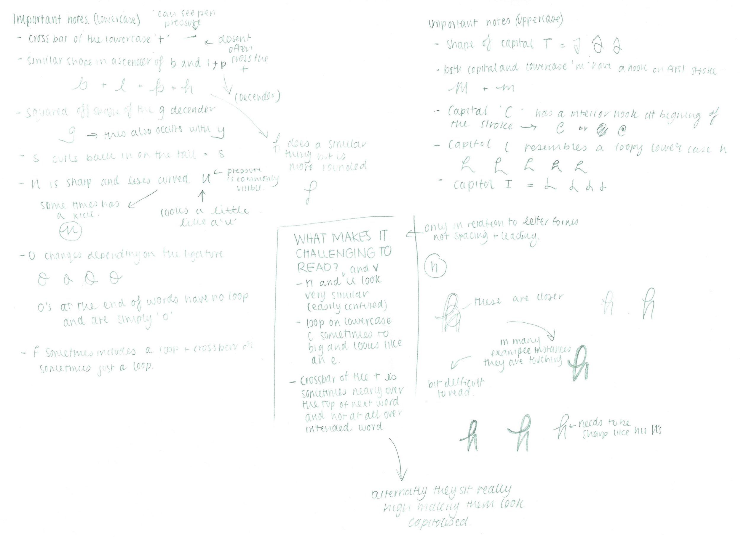
Wayne Thompson from The Australian Type Foundry was commissioned to produce a typeface that captured the writing style of the iconic Nelson Mandela.
My role in this project was preliminary research. Examining hand writing examples (included above) of Nelson Mandela, taking note of reoccurring letter forms, ligatures and general notes on style and legibility.